 The Grid layout is one of the layout options of the group block. It is extremely useful for displaying a set of images or small “cards” of content.


Items can be displayed neatly, in as many columns across the page as you like.
Grid Layout Adjusts for Different Screen Sizes
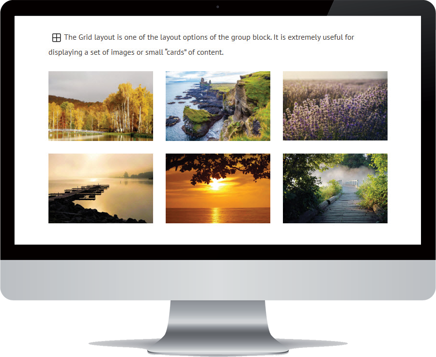
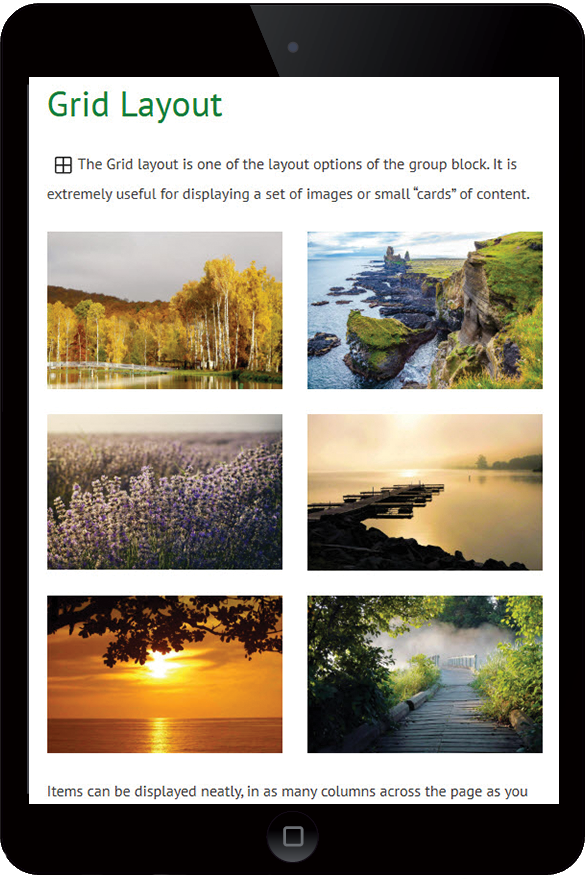
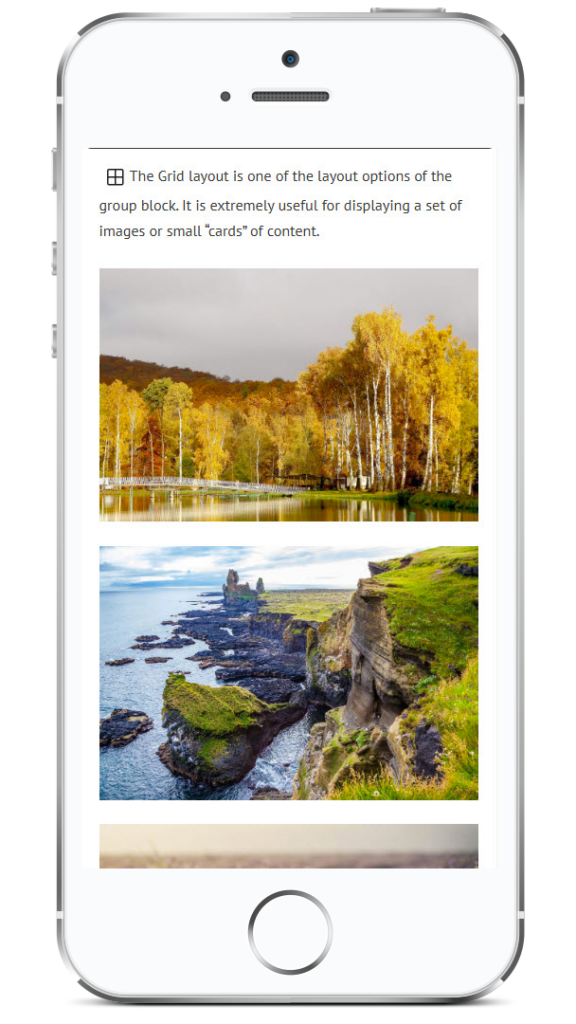
Without changing any settings, the grid layout will adjust naturally for smaller screen sizes.
The default grid layout displays 3 columns across, but when screen sizes are smaller, it will wrap onto further rows, ensuring that the columns are not squeezed smaller than the minimum width setting. So on tablet size screens, items will sit two across, and on mobile they will sit one below the other.
Choose Your Grid
If you want a different layout – different number of columns or different minimum column width, you can adjust these in the Grid settings sidebar.
In the Grid settings sidebar1, scroll down to the Layout section.
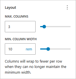
Max Columns field: you can choose the number of columns you would like to see on a typical desktop screen.
Min Column Width field: fill in the minimum width for your items. This means that columns will wrap to fewer per row when they can no longer maintain the minimum width.
Best practice is to fill in both of these fields. This allows you to choose your preferred layout for larger screens, while allowing your grid to adjust for smaller screen sizes. If you leave the Min Column Width field blank, the grid will maintain your chosen number of columns across, regardless of the screen size, like the grid below:
Grid with no Min Column Width value ie no minimum size for the grid items.
Example Grid
This grid has Max Columns: 2, Min Column Width: 240px.
Each grid item is itself a group containing an icon, header and paragraph, and the group is styled with border and shading for interest.
Onsite SEO
Mauris vel quam nunc. Quisque tempor tempus aliquet. Donec egestas odio et tempor.
Membership Site
Mauris vel quam nunc. Quisque tempor tempus aliquet. Donec egestas odio et tempor. Mauris vel quam nunc. Quisque tempor tempus aliquet.
Online Store
Mauris vel quam nunc. Quisque tempor tempus aliquet. Donec egestas odio et tempor.
Environment Upgrades
Mauris vel quam nunc. Quisque tempor tempus aliquet. Donec egestas odio et tempor.
After choosing your grid layout values, test the grid on different screen sizes2, to be sure that the values make sense, and the grid content looks good (and readable) on all screens.
- Be sure you select the grid itself to change the settings (and not one of the grid items). Use the breadcrumbs at the bottom of the editor page, or the document overview, in order to select the right block. See “finding your way around the block editor” for further help. ↩︎
- You can use the Preview control in the top right menu
 to preview your content in different screen sizes, without leaving the editor page. Note that this is not an exhaustive test, but does provide an initial indication of how the page will look on smaller screens. ↩︎
 to preview your content in different screen sizes, without leaving the editor page. Note that this is not an exhaustive test, but does provide an initial indication of how the page will look on smaller screens.